# md-editor-v3
**Repository Path**: g_w_d/md-editor-v3
## Basic Information
- **Project Name**: md-editor-v3
- **Description**: No description available
- **Primary Language**: JavaScript
- **License**: MIT
- **Default Branch**: develop
- **Homepage**: None
- **GVP Project**: No
## Statistics
- **Stars**: 0
- **Forks**: 2
- **Created**: 2024-11-22
- **Last Updated**: 2024-11-22
## Categories & Tags
**Categories**: Uncategorized
**Tags**: None
## README
# 🎄 md-editor-v3
   
English \| [中文](https://github.com/imzbf/md-editor-v3/blob/develop/README-CN.md)
Markdown editor for vue3, developed in `jsx` and `typescript`.
- Documentation and example: [Go](https://imzbf.github.io/md-editor-v3)
- Use it online: [Go](https://codesandbox.io/s/epic-bird-2znqo)
- The same series editor for react: [md-editor-rt](https://github.com/imzbf/md-editor-rt)
## ⭐️ Features
- Toolbar, screenfull or screenfull in web pages and so on.
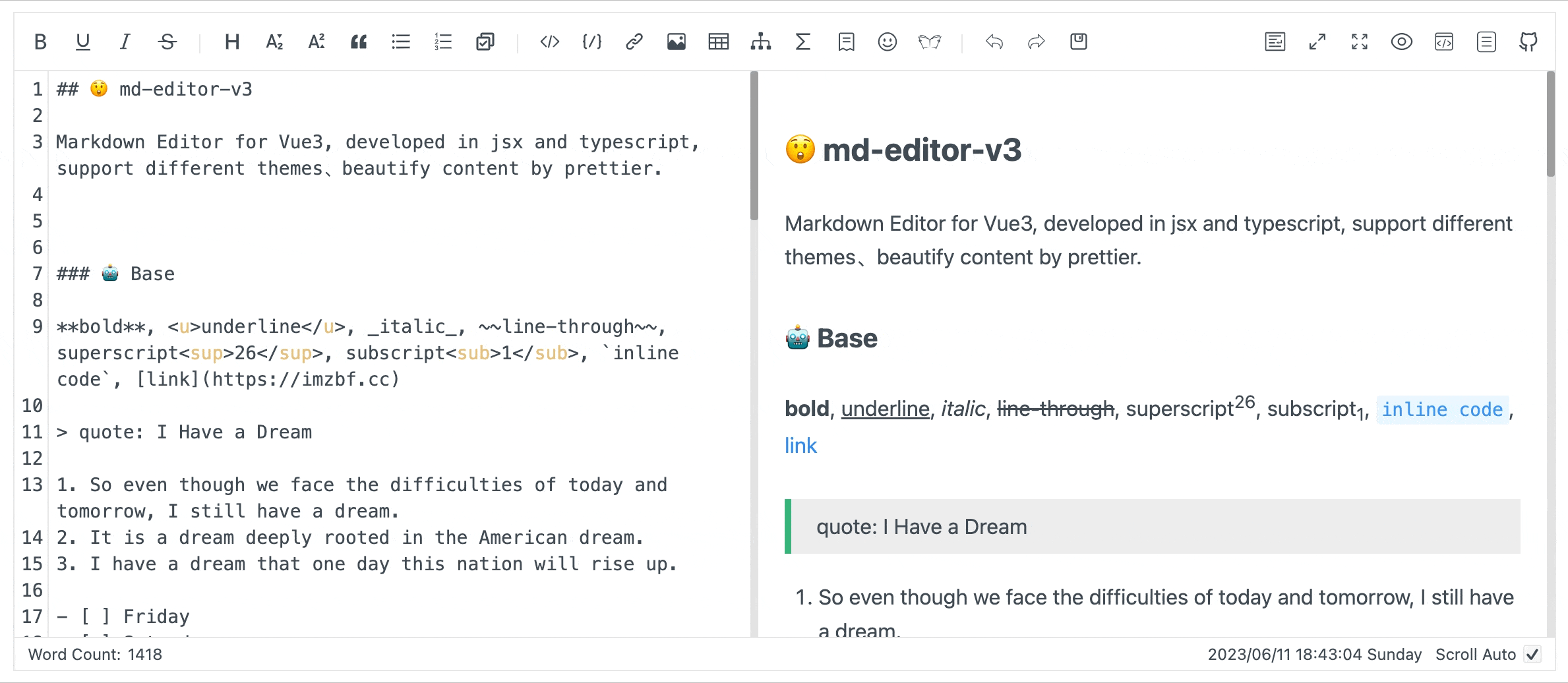
- Themes, Built-in default and dark themes.
- Shortcut key for editor.
- Beautify your content by `prettier`(only for markdown content, not the code and other text).
- Multi-language, build-in Chinese and English(default: Chinese).
- Upload picture, paste or clip the picture and upload it.
- Render article directly(no editor, no event listener, only preview of content).
- Theme of preview, `default`, `vuepress`, `github`, `cyanosis`, `mk-cute`, `smart-blue` styles(not identical). It can be customized also(Refer to example page).
- `mermaid`(>=1.8.0), `katex` mathematical formula(>=1.9.0).
- Customize the toolbar as you like.
- On-demand Import(>=4.0.0).
## 📦 Install
```shell
yarn add md-editor-v3
```
Use existing extension of language and theme, such as Japanese
```shell
yarn add @vavt/cm-extension
```
Use existing components of toolbar, such as exporting content as PDF
```shell
yarn add @vavt/v3-extension
```
For more ways to use or contribute, please refer to: [md-editor-extension](https://github.com/imzbf/md-editor-extension)
## 💡 Usage
### ✍🏻 Display Editor
```vue
```
> `^4.0.0`, internal components can be imported on-demand.
> If there are multiple editors on the page, please set different `editorId` for each editor!
### 📖 Preview Only
```vue
```
## 🗺 Preview
| Default theme | Dark theme | Preview only |
| --- | --- | --- |
| 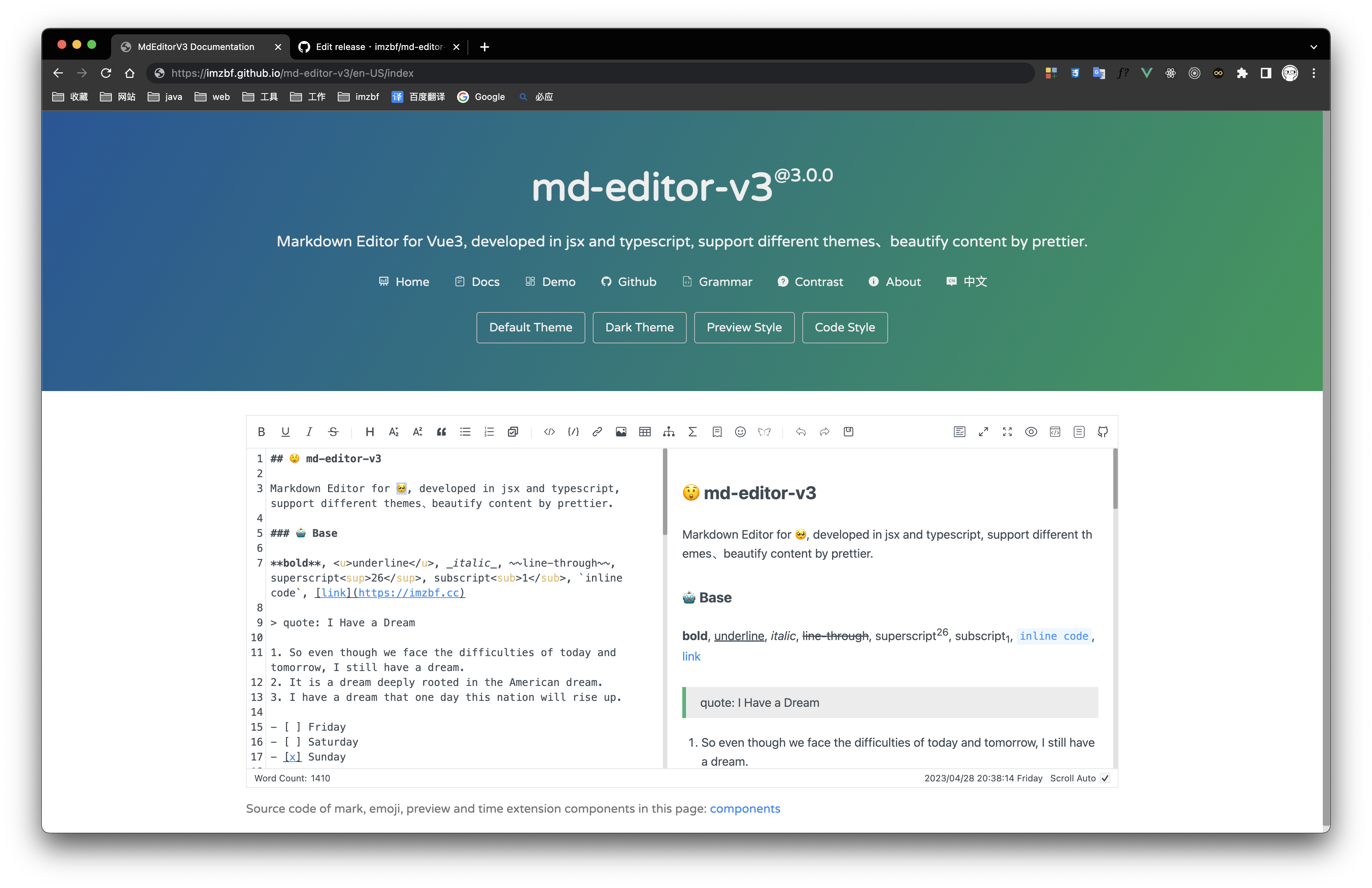 | 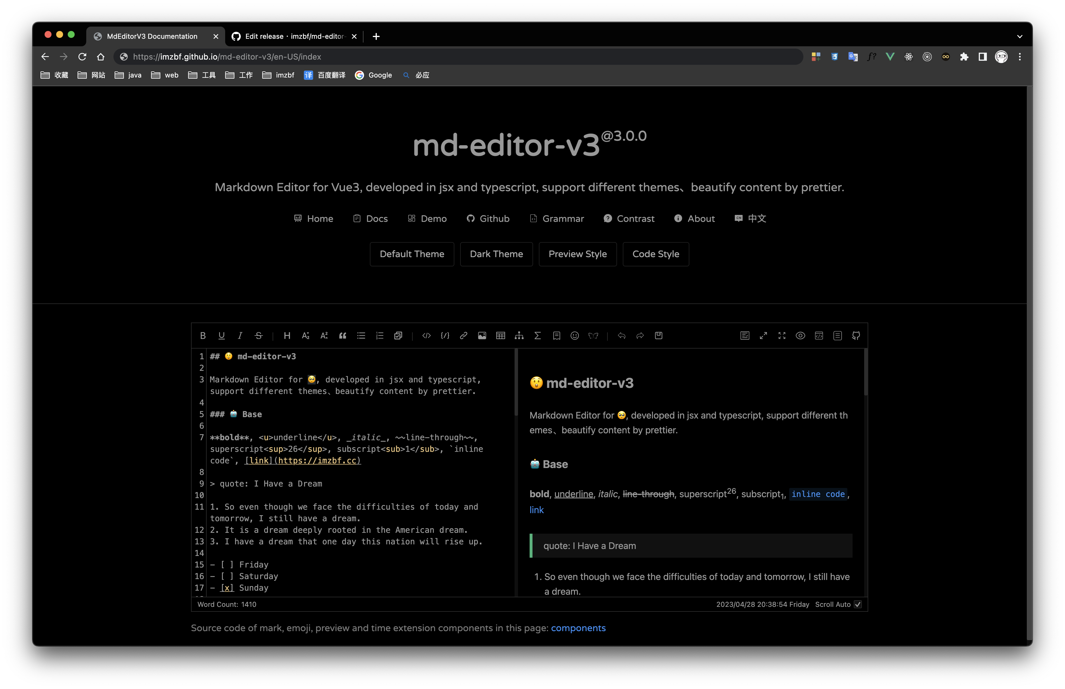 |  |
Inputing prompt and mark, emoji extensions
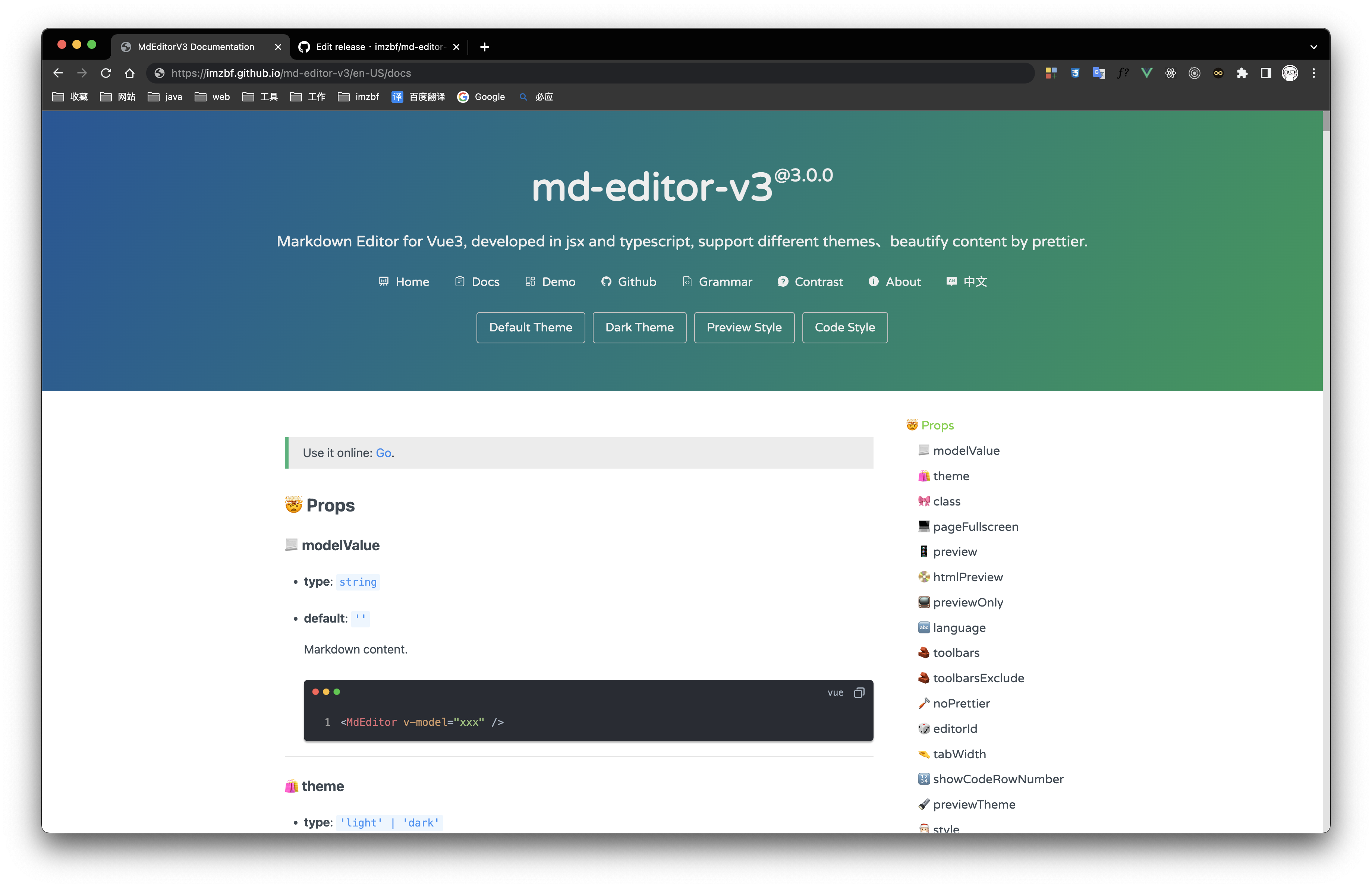
## 🎁 Apis
### 🔖 MdPreivew Props
| name | type | default | description |
| --- | --- | --- | --- |
| modelValue | `string` | '' | Markdown content, use `v-model` in vue template |
| theme | `'light' \| 'dark'` | 'light' | Editor theme |
| class | `string` | '' | |
| language | `string` | 'zh-CN' | Build-in language('zh-CN','en-US') |
| editorId | `string` | 'md-editor-v3' | Editor's id, it is used when there are more than two editors in the same page |
| showCodeRowNumber | `boolean` | false | Show row number for code block or not |
| previewTheme | `'default' \| 'github' \| 'vuepress' \| 'mk-cute' \| 'smart-blue' \| 'cyanosis'` | 'default' | Theme of preview, can be customized |
| style | `string \| CSSProperties` | {} | Inline style |
| noMermaid | `boolean` | false | Use mermaid or not |
| noKatex | `boolean` | false | Use katex or not |
| codeTheme | `'atom' \| 'a11y' \| 'github' \| 'gradient' \| 'kimbie' \| 'paraiso' \| 'qtcreator' \| 'stackoverflow'` | 'atom' | Highlight code style, can be customized also |
| mdHeadingId | `(text: string, level: number, index: number) => string` | (text) => text | H1-H6 `ID` generator |
| sanitize | `(html: string) => string` | (html) => html | Sanitize the html, prevent XSS. After 3.x, dangerous code has been processed by default. Please do not use this attribute unless there are special requirements |
| noIconfont | `boolean` | false | Not append iconfont script, download different versions [SVG](https://at.alicdn.com/t/c/font_2605852_prouiefeic.js)或[Font Class](https://at.alicdn.com/t/c/font_2605852_prouiefeic.css) and import it by yourself |
| formatCopiedText | `(text: string) => string` | (text: string) => text | Format copied code |
| codeStyleReverse | `boolean` | true | Code style will be reversed to dark while code block of the theme has a dark background |
| codeStyleReverseList | `Array` | ['default', 'mk-cute'] | Themes to be reversed |
| noHighlight | `boolean` | false | Highlight code or not |
| noImgZoomIn | `boolean` | false | Enable the function of enlarging images |
| customIcon | `CustomIcon` | {} | Customized icons |
| sanitizeMermaid | `(h: string) => Promise` | (h: string) => Promise.resolve(h) | Convert the generated mermaid code |
### 🔩 MdEditor Props
Except for the same as `MdPreview`:
| name | type | default | description |
| --- | --- | --- | --- |
| pageFullscreen | `boolean` | false | Screenfull in web page |
| preview | `boolean` | true | Preview content in editor |
| htmlPreview | `boolean` | false | Preview html in editor(If true, preview must be false) |
| toolbars | `Array` | [toolbars] | Show contents of toolbar, all keyssee `toolbars` below |
| toolbarsExclude | `Array` | [] | Don't show contents of toolbar, all keys`toolbars` |
| noPrettier | `boolean` | false | Use prettier to beautify content or not |
| tabWidth | `number` | 2 | One tab eq some spaces |
| tableShape | `[number, number]` | [6, 4] | Preset the size of the table, [columns, rows] |
| placeholder | `string` | '' | |
| footers | `Array<'markdownTotal' \| '=' \| 'scrollSwitch' \| number>` | ['markdownTotal', '=', 'scrollSwitch'] | Show contents of footer, they are divided by `'='`. Set it to `[]` to hidden footer |
| scrollAuto | `boolean` | true | Scroll default setting |
| noUploadImg | `boolean` | false | Not show the entrance to upload pictures |
| autoFocus | `boolean` | false | same as `autofocus` in native textarea |
| disabled | `boolean` | false | same as `disabled` in native textarea |
| readOnly | `boolean` | false | same as `readonly` in native textarea |
| maxLength | `number` | | same as `maxlength` in native textarea |
| autoDetectCode | `boolean` | false | auto detect the type of pasted code, only support that copied from `vscode` |
| completions | `Array` | [] | `@codemirror/autocomplete` List of function to match keywords |
| showToolbarName | `boolean` | false | Show toolbar name or not |
| inputBoxWitdh | `string` | '50%' | Default width of input box |
| transformImgUrl | `(imgUrl: string) => string \| Promise` | t => t | Transform image links |
『toolbars』
```js
[
'bold',
'underline',
'italic',
'-',
'strikeThrough',
'title',
'sub',
'sup',
'quote',
'unorderedList',
'orderedList',
'task', // ^2.4.0
'-',
'codeRow',
'code',
'link',
'image',
'table',
'mermaid',
'katex',
'-',
'revoke',
'next',
'save',
'=',
'pageFullscreen',
'fullscreen',
'preview',
'previewOnly',
'htmlPreview',
'catalog',
'github'
];
```
> You can sort the toolbar as you like, split tools by `'-'`, the left and right toolbars are divided by `'='`!
> You can customize the toolbar. To display them, put index of `defToolbars` into `toolbars`(this is not standard), for more usage, please refer to [docs](https://imzbf.github.io/md-editor-v3/docs).
『StaticTextDefaultValue』
Expand language, you need to replace all the content here:
```ts
export interface ToolbarTips {
bold?: string;
underline?: string;
italic?: string;
strikeThrough?: string;
title?: string;
sub?: string;
sup?: string;
quote?: string;
unorderedList?: string;
orderedList?: string;
task?: string; // ^2.4.0
codeRow?: string;
code?: string;
link?: string;
image?: string;
table?: string;
mermaid?: string;
katex?: string;
revoke?: string;
next?: string;
save?: string;
prettier?: string;
pageFullscreen?: string;
fullscreen?: string;
catalog?: string;
preview?: string;
previewOnly?: string;
htmlPreview?: string;
github?: string;
'-'?: string;
'='?: string;
}
export interface StaticTextDefaultValue {
// Toolbar hover tips(html title)
toolbarTips?: ToolbarTips;
// H1-H6 dropdown menu item
titleItem?: {
h1?: string;
h2?: string;
h3?: string;
h4?: string;
h5?: string;
h6?: string;
};
imgTitleItem?: {
link: string;
upload: string;
clip2upload: string;
};
// The modal tips of add link or upload picture
linkModalTips?: {
linkTitle?: string;
imageTitle?: string;
descLabel?: string;
descLabelPlaceHolder?: string;
urlLabel?: string;
urlLabelPlaceHolder?: string;
buttonOK?: string;
};
// The modal tips of clip the picture, v1.2.0
clipModalTips?: {
title?: string;
buttonUpload?: string;
};
copyCode?: {
text?: string;
successTips?: string;
failTips?: string;
};
mermaid?: {
flow?: string;
sequence?: string;
gantt?: string;
class?: string;
state?: string;
pie?: string;
relationship?: string;
journey?: string;
};
katex?: {
// formula inline
inline: string;
// formula block
block: string;
};
footer?: {
markdownTotal: string;
scrollAuto: string;
};
}
```
### 🧵 MdPreview Events
| name | type | description |
| --- | --- | --- |
| onHtmlChanged | `html: string` | Compile markdown successful event, you can use it to get the html code |
| onGetCatalog | `list: Array` | Get catalog of article |
### 🪢 MdEditor Events
Except for the same as `MdPreview`:
| name | type | description |
| --- | --- | --- |
| onChange | `value: string` | Content changed(bind to `oninput` of `textarea`) |
| onSave | `value: string, html: Promise` | Saving content, `ctrl+s` and clicking button will trigger it |
| onUploadImg | `files: Array, callback: (urls: string[] \| { url: string; alt: string; title: string }[]) => void` | Uploading picture, when picture is uploading the modal will not close, please provide right urls to the callback function |
| onError | `err: { name: 'Cropper' \| 'fullscreen' \| 'prettier' \| 'overlength'; message: string }` | Catch run-time error, `Cropper`, `fullscreen` and `prettier` are used when they are not loaded. And content exceeds the length limit error |
| onBlur | `event: FocusEvent` | Textarea has lost focus |
| onFocus | `event: FocusEvent` | Textarea has received focus |
| onInput | `event: Event` | Element gets input |
| onDrop | `event: DragEvent` | Selection is being dragged |
| onInputBoxWitdhChange | `(width: string) => void` | Width of input box has been changed |
### 🎍 Slots
| name | type | default | description |
| --- | --- | --- | --- |
| defToolbars | `Array` | null | Custom toolbar in `DropdownToolbar`, `NormalToolbar` or `ModalToolbar` |
| defFooters | `Array` | null | Custom footer |
`NormalToolbar` example:
```vue
```
## 🤱🏼 Expose
After 2.5.0, Editor exposes several methods on the instance, used to get or change the internal status of the editor.
```vue
```
> Switched to the opposite status, if toggle without input parameter.
### 👂🏼 on
Get the internal state of the editor, including pageFullscreen, fullscreen, preview, htmlPreview, catalog, etc.
- pageFullscreen
```js
editorRef.value?.on('pageFullscreen', (status) => console.log(status));
```
- fullscreen
```js
editorRef.value?.on('fullscreen', (status) => console.log(status));
```
- preview
```js
editorRef.value?.on('preview', (status) => console.log(status));
```
- previewOnly
```js
editorRef.value?.on('previewOnly', (status) => console.log(status));
```
- htmlPreview
```js
editorRef.value?.on('htmlPreview', (status) => console.log(status));
```
- catalog
```js
editorRef.value?.on('catalog', (status) => console.log(status));
```
### 💻 togglePageFullscreen
Toggle status of fullscreen within the page.
```js
editorRef.value?.togglePageFullscreen(true);
```
### 🖥 toggleFullscreen
Toggle status of fullscreen widthin browser.
```js
editorRef.value?.toggleFullscreen(true);
```
### 📖 togglePreview
Toggle status of preview.
```js
editorRef.value?.togglePreview(true);
```
### 📖 togglePreviewOnly
Toggle into Preview Only Mode.
```js
editorRef.value?.togglePreviewOnly(true);
```
### 📼 toggleHtmlPreview
Toggle status of htmlPreview.
```js
editorRef.value?.toggleHtmlPreview(true);
```
### 🧬 toggleCatalog
Toggle status of catalog.
```js
editorRef.value?.toggleCatalog(true);
```
### 💾 triggerSave
```js
editorRef.value?.triggerSave();
```
### 💉 insert
Manually insert content into textarea.
```js
/**
* @params selectedText
*/
editorRef.value?.insert((selectedText) => {
/**
* @return targetValue Content to be inserted
* @return select Automatically select content, default: true
* @return deviationStart Start position of the selected content, default: 0
* @return deviationEnd End position of the selected content, default: 0
*/
return {
targetValue: `${selectedText}`,
select: true,
deviationStart: 0,
deviationEnd: 0
};
});
```
For more examples, refer to source code of [extension component](https://github.com/imzbf/md-editor-v3/blob/dev-docs/src/components/MarkExtension/index.vue)
### 🎯 focus
Focus on textarea.
```ts
import type { FocusOption } from 'md-editor-v3';
const option: FocusOption | undefined = 'start';
// Cursor position when focusing on textarea, default: position when it last lost focus
editorRef.value?.focus(option);
```
### ✒️ rerender
Re render the content.
```js
editorRef.value?.rerender();
```
### 🔍 getSelectedText
Get the currently selected text.
```js
console.log(editorRef.value?.getSelectedText());
```
### 🗑 resetHistory
Clear current history.
### 🎛 domEventHandlers
Supports listening to all DOM events.
```js
editorRef.value?.domEventHandlers({
compositionstart: () => {
console.log('compositionstart');
}
});
```
### 🎛 execCommand
Insert content into the editor via trigger.
```js
editorRef.value?.execCommand('bold');
```
## 💴 Config Editor
Use `config(option: ConfigOption)` to reconfigure `markdown-it` and so on.
### codeMirrorExtensions
Customize new extensions based on theme and default extensions f codeMirror.
Example: Editor does not render the line number of textarea by default, this extension needs to be manually added
```js
import { config } from 'md-editor-v3';
import { lineNumbers } from '@codemirror/view';
config({
codeMirrorExtensions(_theme, extensions) {
return [...extensions, lineNumbers()];
}
});
```
### markdownItConfig
Customize extensions, attributes of `markdown-it`, etc.
```ts
type MarkdownItConfig = (
md: markdownit,
options: {
editorId: string;
}
) => void;
```
Example: Use `markdown-it-anchor` to render a hyperlink symbol to the right of the title
```js
import { config } from 'md-editor-v3';
import ancher from 'markdown-it-anchor';
config({
markdownItConfig(mdit) {
mdit.use(ancher, {
permalink: true
});
}
});
```
### markdownItPlugins
Select and add built-in plugins to `markdown-it`.
```ts
type MarkdownItPlugins = (
plugins: Array,
options: {
editorId: string;
}
) => Array;
```
Example: Modify the class name of the image.
```js
import { config } from 'md-editor-v3';
config({
markdownItPlugins(plugins) {
return plugins.map((p) => {
if (p.type === 'image') {
return {
...p,
options: {
...p.options,
classes: 'my-class'
}
};
}
return p;
});
}
});
```
### editorConfig
Add more languages, reset `mermaid` template or delay rendering time:
```js
import { config } from 'md-editor-v3';
config({
editorConfig: {
languageUserDefined: { lang: StaticTextDefaultValue },
mermaidTemplate: {
flow: `flow tempalte`,
...more
},
// Default 500ms. It is set to 0ms when preview only and not set.
renderDelay: 500
}
});
```
### editorExtensions
Config some dependency libraries, like highlight..
```typescript
import { config } from 'md-editor-v3';
config({
editorExtensions: { iconfont: 'https://xxx.cc' }
});
```
『EditorExtensions』
```ts
export interface EditorExtensions {
highlight?: {
instance?: any;
js?: string;
css?: {
[key: string]: {
light: string;
dark: string;
};
};
};
prettier?: {
standaloneJs?: string;
parserMarkdownJs?: string;
};
cropper?: {
instance?: any;
js?: string;
css?: string;
};
iconfont?: string;
screenfull?: {
instance?: any;
js?: string;
};
mermaid?: {
instance?: any;
js?: string;
};
katex?: {
instance?: any;
js?: string;
css?: string;
};
}
```
### 🫨 iconfontType
Set the way to display icons:
- `svg`: with symbol
- `class`: with font-class
If the icon is customized through the attribute `customIcon`, the customized icon will be used first.
### 🎨 mermaidConfig
Configure `mermaid`, [Details](https://mermaid.js.org/config/schema-docs/config.html)
```js
import { config } from 'md-editor-v3';
config({
mermaidConfig(base: any) {
return {
...base,
logLevel: 'error'
};
}
});
```
## 🪡 Shortcut Key
_Pay attention: shortcut keys are only available when the textarea has received focus!_
| key | function | description |
| --- | --- | --- |
| TAB | insert space | Insert space, the length eq `tabWidth`, default: 2, support multiline |
| SHIFT + TAB | delete space, setting is the same as Tab | |
| CTRL + C | copy | When selected, copy the selected content. When not selected, copy the content of the current line |
| CTRL + X | shear | When selected, cut the selected content. When not selected, cut the current line |
| CTRL + D | delete | When selected, delete the selected content. When not selected, delete the current line |
| CTRL + S | save | Trigger `onSave` event |
| CTRL + B | bold text | `**bold**` |
| CTRL + U | underline | `underline` |
| CTRL + I | italic | `*italic*` |
| CTRL + 1-6 | h1-h6 | `# title` |
| CTRL + ↑ | superscript | `superscript` |
| CTRL + ↓ | subscript | `subscript` |
| CTRL + O | ordered list | `1. ordered list` |
| CTRL + L | link | `[link](https://github.com/imzbf/md-editor-v3)` |
| CTRL + Z | withdraw | Withdraw history in editor, not the function of system |
| CTRL + SHIFT + S | line-through | `~line-through~` |
| CTRL + SHIFT + U | unordered list | `- unordered list` |
| CTRL + SHIFT + C | code block | |
| CTRL + SHIFT + I | picture | `` |
| CTRL + SHIFT + Z | forward | Forward history in editor, not the function of system |
| CTRL + SHIFT + F | Beautify | |
| CTRL + ALT + C | code row | |
| CTRL + SHIFT + ALT + T | table | `\|table\|` |
## 🪤 Internal Components
```vue
```
On-demand import. For more examples, refer to [document](https://imzbf.github.io/md-editor-v3).
### 🐣 NormalToolbar
`NormalToolbar`
- **props**
- `title`: `string`, not necessary, title of toolbar.
- **events**
- `onClick`: `(e: MouseEvent) => void`, necessary.
- **slots**
- `trigger`: `VNode | JSX.Element`, necessary, it is usually an icon, which is displayed on the toolbar.
### 🐼 DropdownToolbar
`DropdownToolbar`
- **props**
- `title`: `string`, not necessary, title of toolbar.
- `visible`: `boolean`, necessary.
- **events**
- `onChange`: `(visible: boolean) => void`, necessary.
- **slots**
- `trigger`: `VNode | JSX.Element`, necessary, it is usually an icon, which is displayed on the toolbar.
- `overlay`: `VNode | JSX.Element`, necessary, content of dropdown box.
### 🦉 ModalToolbar
`ModalToolbar`
- **props**
- `title`: `string`, not necessary, title of toolbar.
- `modalTitle`: `string`, not necessary, title of the Modal.
- `visible`: `boolean`, necessary, visibility of Modal.
- `width`: `string`, not necessary, width of Modal, default `auto`.
- `height`: `string`, same as `width`.
- `showAdjust`: `boolean`, not necessary, visibility of fullscreen button.
- `isFullscreen`: `boolean`, necessary when `showAdjust = true`, status of fullscreen.
- **events**
- `onClick`: `() => void`, necessary.
- `onClose`: `() => void`, necessary, closed event.
- `onAdjust`: `(val: boolean) => void`, fullscreen button was clicked.
- **slots**
- `trigger`: `VNode | JSX.Element`, necessary, it is usually an icon, which is displayed on the toolbar.
- `default`: `VNode | JSX.Element`, necessary, content of Modal.
### 🐻 MdCatalog
`MdCatalog`
- **props**
- `editorId`: `string`, necessary, same as editor's `editorId`, used to register listening events.
- `class`: `string`, not necessary.
- `mdHeadingId`: `MdHeadingId`, not necessary, same as editor.
- `scrollElement`: `string | HTMLElement`, not necessary, it is an element selector when its type is string. When `previewOnly` eq `true`, it is usually set to `document.documentElement`.
- `theme`: `'light' | 'dark'`, not necessary, provide it when you want to change theme online, it is the same as Editor `theme`.
- `offsetTop`: `number`, not necessary, highlight current item of catalogs when title is `offsetTop` pixels from the top, default 20.
- `scrollElementOffsetTop`: `number`, not necessary, offsetTop of the scroll container,default 0.
- **events**
- `onClick`: `(e: MouseEvent, t: TocItem) => void`, not necessary, heading was clicked.
- `onActive`: `(heading: HeadList | undefined) => void`, not necessary, heading was highlighted.
### 🛸 MdModal
`MdModal`
- **props**
- `title`: `string`, not necessary, title of Modal.
- `visible`: `boolean`, necessary, visibility of Modal.
- `width`: `string`, not necessary, width of Modal, default `auto`.
- `height`: `string`, same as `width`.
- `showAdjust`: `boolean`, not necessary, visibility of fullscreen button.
- `isFullscreen`: `boolean`, necessary when `showAdjust = true`, status of fullscreen.
- `className`: `string`, not necessary.
- `style`: `CSSProperties`, not necessary.
- **events**
- `onClose`: `() => void`, necessary, closed event.
- `onAdjust`: `(val: boolean) => void`, fullscreen button was clicked.
- **slots**
- `default`: `VNode | JSX.Element`, necessary, content of Modal.
## 🪤 Internal Configuration
```js
import {
iconfontClassUrl,
iconfontSvgUrl,
allToolbar,
allFooter,
zh_CN,
en_US
} from 'md-editor-v3';
console.log(iconfontClassUrl, iconfontSvgUrl, allToolbar, allFooter, zh_CN, en_US);
```
## 🗂 Examples
### 🎸 Jsx Template
```jsx
import { defineComponent, reactive } from 'vue';
import { MdEditor } from 'md-editor-v3';
import 'md-editor-v3/lib/style.css';
export default defineComponent({
setup() {
const md = reactive({
text: '# Hello Editor'
});
return () => (
(md.text = value)} />
);
}
});
```
### 🥹 Upload Picture
> Tips: When you paste and upload GIF, it will upload a static picture. So you should upload it by file system!
```vue
```
### 🧙♂️ Change Styles
```less
.css-vars(@isDark) {
--md-color: if(@isDark, #999, #222);
--md-hover-color: if(@isDark, #bbb, #000);
--md-bk-color: if(@isDark, #000, #fff);
--md-bk-color-outstand: if(@isDark, #111, #f6f6f6);
--md-bk-hover-color: if(@isDark, #1b1a1a, #f5f7fa);
--md-border-color: if(@isDark, #2d2d2d, #e6e6e6);
--md-border-hover-color: if(@isDark, #636262, #b9b9b9);
--md-border-active-color: if(@isDark, #777, #999);
--md-modal-mask: #00000073;
--md-scrollbar-bg-color: if(@isDark, #0f0f0f, #e2e2e2);
--md-scrollbar-thumb-color: if(@isDark, #2d2d2d, #0000004d);
--md-scrollbar-thumb-hover-color: if(@isDark, #3a3a3a, #00000059);
--md-scrollbar-thumb-active-color: if(@isDark, #3a3a3a, #00000061);
}
.md-editor {
.css-vars(false);
}
.md-editor-dark {
.css-vars(true);
}
```
Change background color in dark mode:
```css
.md-editor-dark {
--md-bk-color: #333 !important;
}
```